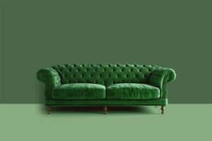
As Pantone reveals its 2025 "Colour of the Year," the spotlight turns to paint trends that are reshaping interior design.
Choosing a room's colour is a significant decision, often lasting years, yet colour trends are captivating homeowners more than ever. From bold jewel tones to rich, moody hues, these shades are influencing how spaces are designed and experienced.
Experts like Bonnie Pierre-Davis from WGSN highlight the growing appeal of "tinted darks," driven by influences from fashion to interior product design. Whether it’s Pantone’s "mocha mousse" or deep greens, these colours offer therapeutic qualities while pushing the boundaries of creativity and comfort.
1. Mocha Mousse
Pantone’s Colour of the Year 2025, "mocha mousse," captures the essence of comforting indulgence. This beigey-brown shade evokes the warmth of cocoa powder or frothy coffee, appealing to a post-pandemic desire for simple, satisfying pleasures. It pairs beautifully with soft materials like suede or velvet, creating cozy yet elegant interiors. Used with white, it delivers a sharp, modern contrast.
2. Avocado and Olive Green
Layered green tones bring nature indoors with striking results. In one example, three shades—olive green for walls, bottle green for ceilings, and lime green for window paneling—create an immersive effect. Ruth Mottershead from Little Greene credits this trend to growing consumer confidence and the timeless appeal of greens, which mimic the harmonious variety found in nature.
3. Burgundy and Crimson
Rich reds and dusky pinks combine for dynamic contrast. Betsy Smith of Graphenstone explains how mixing warm tones like cinnamon, carnelian, and cinnabar creates visual depth. Accents, such as a vibrant red bookcase interior, add pops of colour that balance the room's overall warmth.
How to Combine Colors in Your Home | Designing Your Home Interior Color Palette
Video by Nick Lewis
4. Plum and Grape Tones
Deep, matte purples like Neptune’s "clove" offer an enveloping richness without feeling oppressive. This rare shade conjures images of juniper berries and dark woods, creating a bohemian, mid-century atmosphere. It pairs beautifully with vintage furniture and abstract art, giving interiors a touch of decadence.
5. Deep Moss Green
Dark moss green introduces a meditative and tender quality to interiors. Despina Curtis of Etté highlights this colour’s connection to art history and its ability to evoke calm. Perfect for smaller accents like doors or cupboards, this shade avoids overwhelming a space while adding sophistication.
6. Rich Brown
Brown is making a surprising comeback. While often seen as dull, shades like Little Greene’s "galette" offer a rustic charm when paired with natural materials like stone or wood. However, brown works best in spaces with good lighting or a traditional aesthetic, as it can feel lifeless in contemporary or poorly lit interiors.
7. Dusty Rose Pink and Terracotta
Complementary tones like Edward Bulmer’s "rose" and "Etruscan brown" bring warmth and heritage into spaces. Fiona de Lys draws on her Italian roots to create dining rooms that echo Liguria’s trompe l’oeil artistry. These earthy tones are grounding and evoke a sense of connection to nature and history.
8. Warm, Golden Yellows
Golden yellows with brown or orange undertones create sunny, inviting spaces. Little Greene’s "middle buff" offers a neutral yet grounding option, while brighter yellows add vibrancy. Philippa Stockley attributes the popularity of these shades to the influence of artists like Van Gogh, whose radiant yellows inspire uplifting interiors.
9. Ultramarine
Bold blues like Paper and Paint Library’s "plimsoll" bring drama and personality to small spaces. Interior designer Rachel Chudley uses this ultramarine shade to create contrast against lighter tones, adding depth and a sense of coziness to otherwise overlooked areas like under-stairs spaces.
Transforming Spaces with Colour
Colour has the power to completely transform a room's atmosphere, whether through deep, dramatic hues or soft, grounding tones. Experts recommend testing colours under varying light conditions before committing, as lighting significantly impacts how shades appear.
With trends moving toward rich, layered tones, colours like mocha mousse, plum, and moss green invite creativity while fostering comfort and warmth. For those willing to experiment, these shades can make any space feel more personal, stylish, and welcoming.


