Hi, Readers! Color can change the whole feeling of a home in such a quiet but powerful way.
When a room feels flat, crowded, or just a little off, the issue is often not the furniture at all. It is usually the way colors are working together.
A thoughtful mix of a main color, supporting colors, and a few bright highlights can bring depth, comfort, and personality into a space. This kind of color planning is not about making everything match perfectly. It is about creating balance, movement, and a natural sense of layering that makes a room feel complete.
Start with the main color
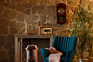
The main color is the one that sets the mood of the room and takes up the largest visual area. It often appears on walls, large rugs, sofas, or curtains. Because it carries so much visual weight, this color should reflect the feeling you want most in the space. Soft neutrals can feel calm and steady, while deeper shades can make a room feel cozy and grounded. A strong main color gives the entire room direction, so it helps to choose this first before anything else.
Add supporting colors for balance
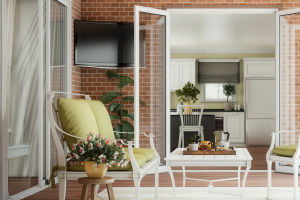
Supporting colors work alongside the main one and help build variety without making the room feel chaotic. These shades usually appear in medium-sized elements like side chairs, bedding, smaller furnishings, or decorative textiles. They should relate to the main color rather than compete with it. One easy approach is to use colors that sit close together on the color wheel for a gentle, connected look, or combine contrasting tones carefully for a little more energy. These supporting shades help the space feel layered, not flat.
Use accent colors with intention
Accent colors are the smallest part of the palette, but they often make the biggest impression. These are the shades that catch the eye in pillows, artwork, lampshades, vases, or other compact details. Because accents stand out, they work best when used sparingly. A bright or rich accent can wake up a neutral room, while a darker accent can add focus and definition. The key is restraint. Just a few touches repeated around the room can tie everything together and make the design feel thoughtful.
Think about proportion
One of the most helpful ideas in color decorating is giving each color a clear role. A common method is to let the main color cover most of the room, use supporting colors in a moderate amount, and save accents for the smallest share. This keeps the room from feeling visually confusing. When every shade gets equal attention, the result can feel restless. But when one leads, another supports, and the last one adds sparkle, the whole room feels more natural and easy to enjoy.
Pay attention to texture and light
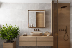
Even if you use only a few colors, a room can still feel rich when texture and lighting are part of the plan. The same shade can look completely different on linen, wood, metal, or painted walls. Natural light also shifts color throughout the day, making some shades appear warmer or cooler. That is why it helps to test colors in the actual room before making final choices. A layered room is never just about hue alone. Surface, finish, and light all shape the final effect.
Keep the room connected
A good color scheme feels cohesive, not repetitive. Repeating the same tones in different places helps guide the eye through the room. A cushion can echo the art on the wall, or a small decorative object can relate to a rug pattern. These little connections make the space feel intentional. At the same time, variation matters too. Mixing materials, patterns, and shade intensity keeps the room from feeling too predictable or stiff.
Color layering at home does not need to feel intimidating. When you begin with one clear main color, bring in supporting shades with care, and finish with small accents that add energy, the room starts to feel more alive and more personal. If you are refreshing a space, try looking at what color is leading now and what might be missing. Sometimes just one thoughtful change can make everything click.